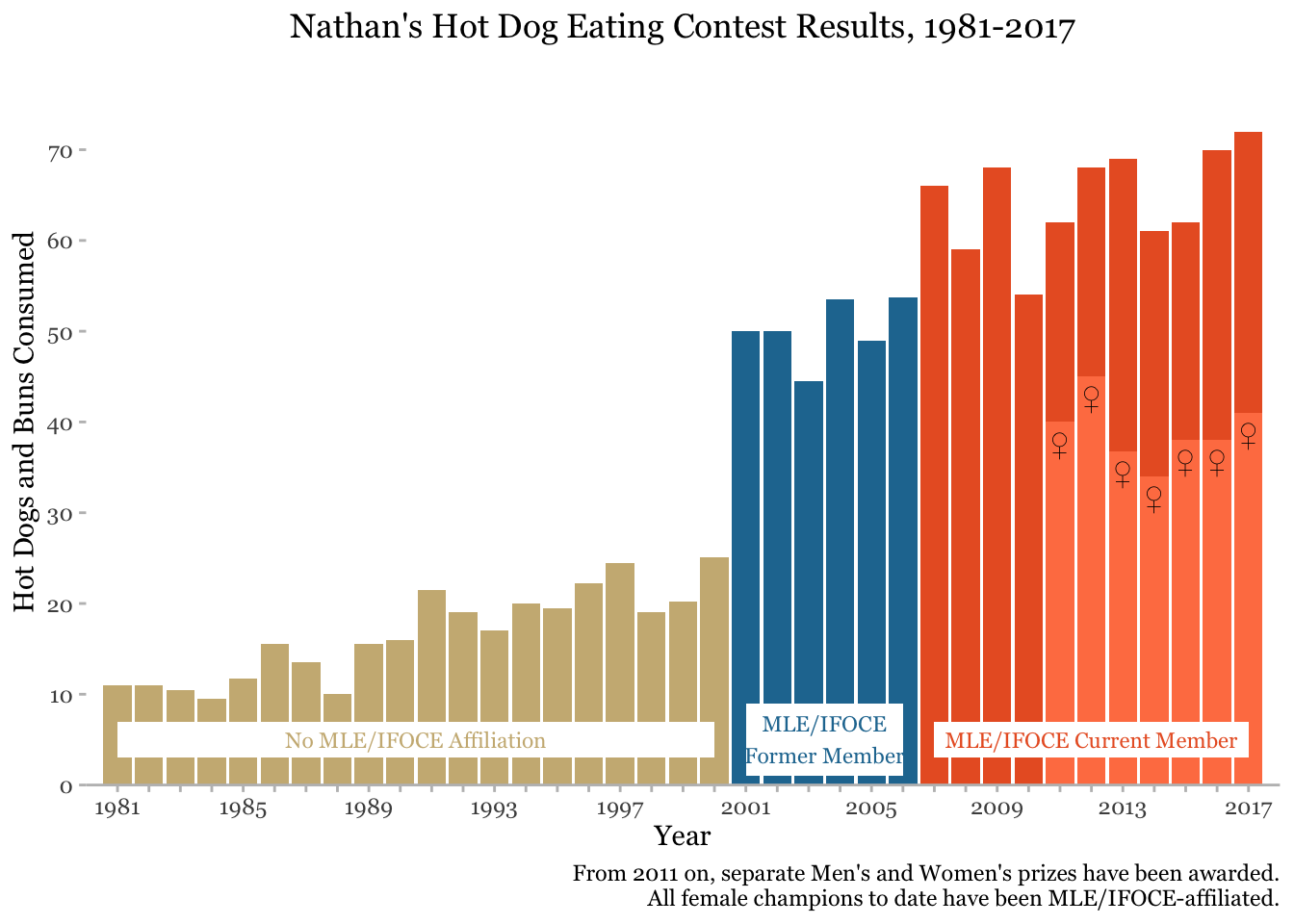
One of the first labs for our data visualization class was to progressively improve a plot displaying the results of many years of a hot dog eating contest. It was enjoyable to take the time to understand the story you are telling and improve the plot through custom annotations.
breaks <- seq(1981, 2017)
labels <- ifelse(breaks %in% seq(1981, 2017, 4), breaks, "")
text_labels <- dt[, .(x = mean(year), y = 5, min = min(year), max = max(year)), by = affiliated]
text_labels[, height := c(4, 8, 4)]
levels(text_labels$affiliated) <- c("MLE/IFOCE Current Member",
                                    "MLE/IFOCE\nFormer Member",
                                    "No MLE/IFOCE Affiliation")

dt %>%
  ggplot() +
  geom_col(aes(x = year, y = num_eaten, fill = affiliated)) +
  geom_col(data = dt_all[gender == "female"],
           aes(x = year, y = num_eaten),
           fill = "coral") +
  geom_tile(data = text_labels, aes(x = x, y = y,
                                    width = max - min,
                                    height = height),
            fill = "white") +
  geom_text(data = text_labels, aes(x = x, y = y,
                                    label = affiliated,
                                    color = affiliated),
            family = "Georgia",
            size = 3) +
  geom_text(data = dt_all[gender == "female"],
            aes(x = year, y = num_eaten),
            label = "♀",
            vjust = 1.5) +
  labs(x = "Year", y = "Hot Dogs and Buns Consumed", title = "Nathan's Hot Dog Eating Contest Results, 1981-2017", caption = "From 2011 on, separate Men's and Women's prizes have been awarded.\nAll female champions to date have been MLE/IFOCE-affiliated.") +
  scale_fill_manual(values = c('#E9602B','#2277A0','#CCB683')) +
  scale_color_manual(values = c('#E9602B','#2277A0','#CCB683')) +
  scale_y_continuous(breaks = seq(0, 70, 10), expand = c(0,0)) +
  scale_x_continuous(expand = c(0, 0), breaks = breaks,
                     labels = labels) +
  coord_cartesian(xlim = c(1980, 2018),
                  ylim = c(0, 80)) +
  theme_classic() +
  theme(axis.line.x = element_line(color = "gray"),
        axis.line.y = element_blank(),
        axis.ticks = element_line(color = "gray"),
        text = element_text(family="Georgia"),
        plot.title = element_text(hjust = 0.5),
        legend.position = "none")