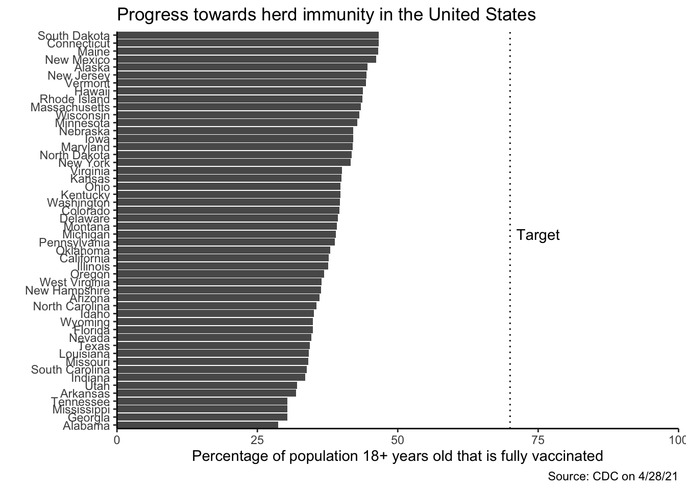
This plot was created for my data visualization class to explore the benefits of a bar graph. I find the bar graph sorted by the other variable a very effective pattern. The data for the plot was downloaded in April from the CDC.
# Downloaded from https://covid.cdc.gov/covid-data-tracker/#vaccinations
library(data.table)
library(datasets)
dt <- fread("covid19_vaccinations_in_the_united_states.csv",
            select = c(1, 16),
            na.strings = "N/A")
setnames(dt, c(1, 2), c("state", "perc_vaccinated"))
dt[state == "New York State", state := "New York"]
dt <- dt[state %in% state.name & !is.na(perc_vaccinated)]
# order by vaccination status
dt[, state := factor(state, levels = dt[order(perc_vaccinated), state])]

library(ggplot2)
ggplot(dt) +
  geom_col(aes(x = perc_vaccinated, y = state)) +
  coord_cartesian(xlim = c(0, 100), expand = FALSE) +
  geom_vline(xintercept = 70, lty = "dotted") +
  labs(title = "Progress towards herd immunity in the United States",
       caption = "Source: CDC on 4/28/21",
       x = "Percentage of population 18+ years old that is fully vaccinated",
       y = "") +
  annotate("text", x = 75, y = "Michigan", label = "Target") +
  theme_classic() +
  scale_fill_manual(values = c(Democratic = "blue", Republican = "red"))